A two week journey around the Apple Isle. Something that, in the midst of what appears an ongoing pandemic, was a huge pressure relief, giving me an opportunity to spend time with Anna and also with close friends (once they’d been released from an overnight stay in a medi-hotel), but also to exercise that itch that every landscape photographer in Melbourne must be feeling, the need to press that shutter trigger.
These are a few images from the trip, with plenty more to come in the next blog post (processing takes time). Taken in a particular part of Tasmania known as the Bay of Fires, on the northern stretch of Tasmania’s east coast, famous for its sunrises, its lichen covered rocks, the blue of the water and the amazing beaches. I didn’t really get great sunrises there, but that just forces a new approach to photography. Make the most of what you have.
The images here were made over a couple of mornings and an evening, all from around Binalong Bay, where the rust-coloured lichen is prominent on the granite boulders, and Scamander. You’ve probably seen the stereotypical images from here: blazing sunrises in colours too vibrant to be true, but apparently they are. No such luck for me, but the rocks and lichen remain beautiful, even in imperfect light.
And still there we moments where the sun spilled out from behind the clouds, casting a golden glow across the ocean. The image above is actually a composite, although made using two images form the same location, just with slightly different exposures (to overcome the intense brightness of the sky). I love its warmth, and the simplicity of the two exposed rock shelfs in the water in the mid-ground.
It is interesting to see the same location in different light, with different framing. Two images here have the same iconic Binalong Bay tree in them, but one was taken in overcast conditions, with a longer exposure, and the other after the sun had lifted above the horizon and the clouds had cleared but not yet hit the rocks. The second one, directly above, has a cool tone that offsets the orange lichen beautifully, and after a little post-production I think it is my preferred of the two.
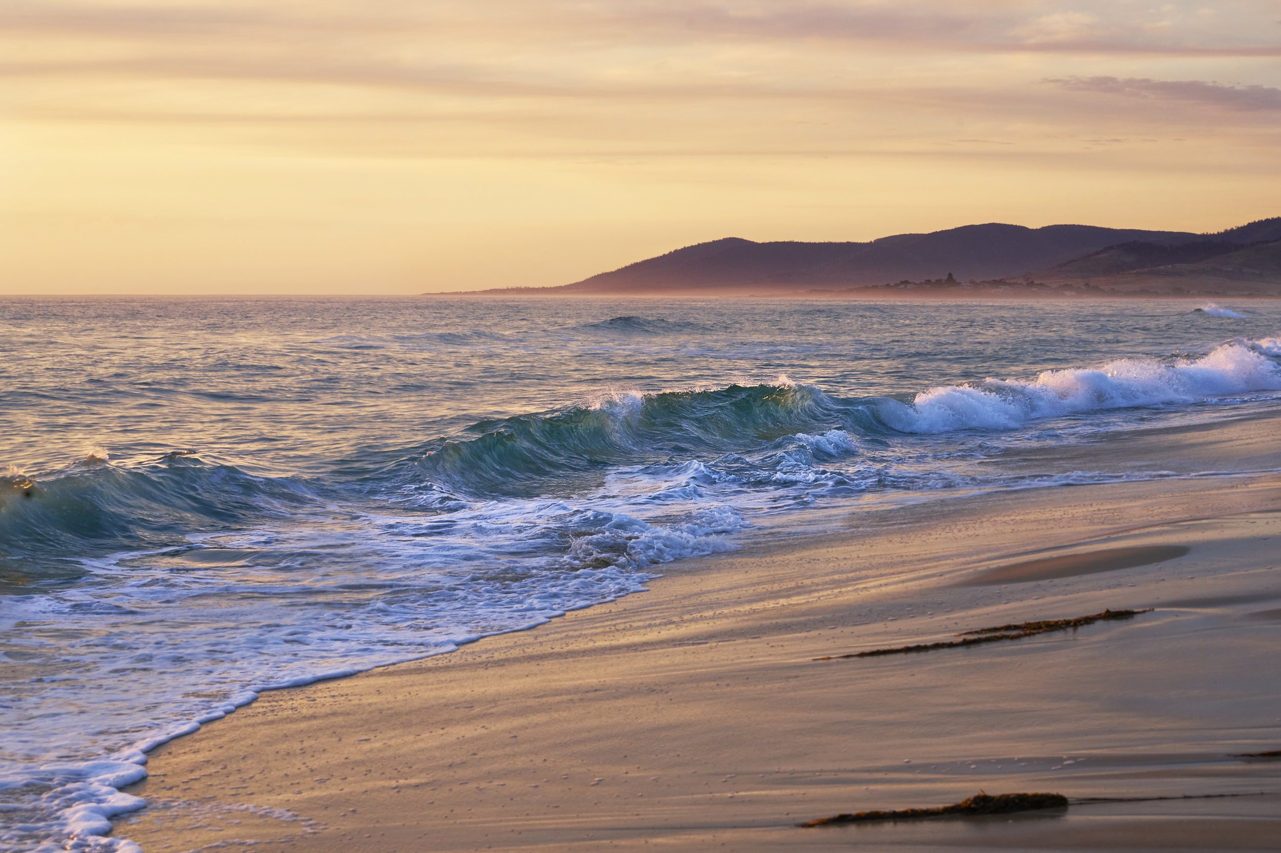
We stayed in a place called Scamander. Big, wide sandy beaches. Distant hills. The night we arrived was the only night with decent light and I had perhaps ten minutes to rush down to the beach and take the shot, but it turned out ok. I do like the curling wave of emerald green and the little hints of sunset on the spray above, and the two tone nature of the image (green and gold) works well. This image isn’t one of my favourites but it does capture the memory, which for holiday snaps is important.


